Project Reveal: Canyon Creek Kitchen + Family Room
As the year comes to a conclusion, getting to finally share what we've been working on for the year feels like a little light at the end of the 2020 tunnel! It's time to kick off a new Project Reveal series featuring our Canyon Creek project. This project was a complete gut job - we're talking every hard surface and then some. Our sweet clients are soon-to-be empty nesters and after living in this home for the last ten years, they were really ready to bring it to the new decade.
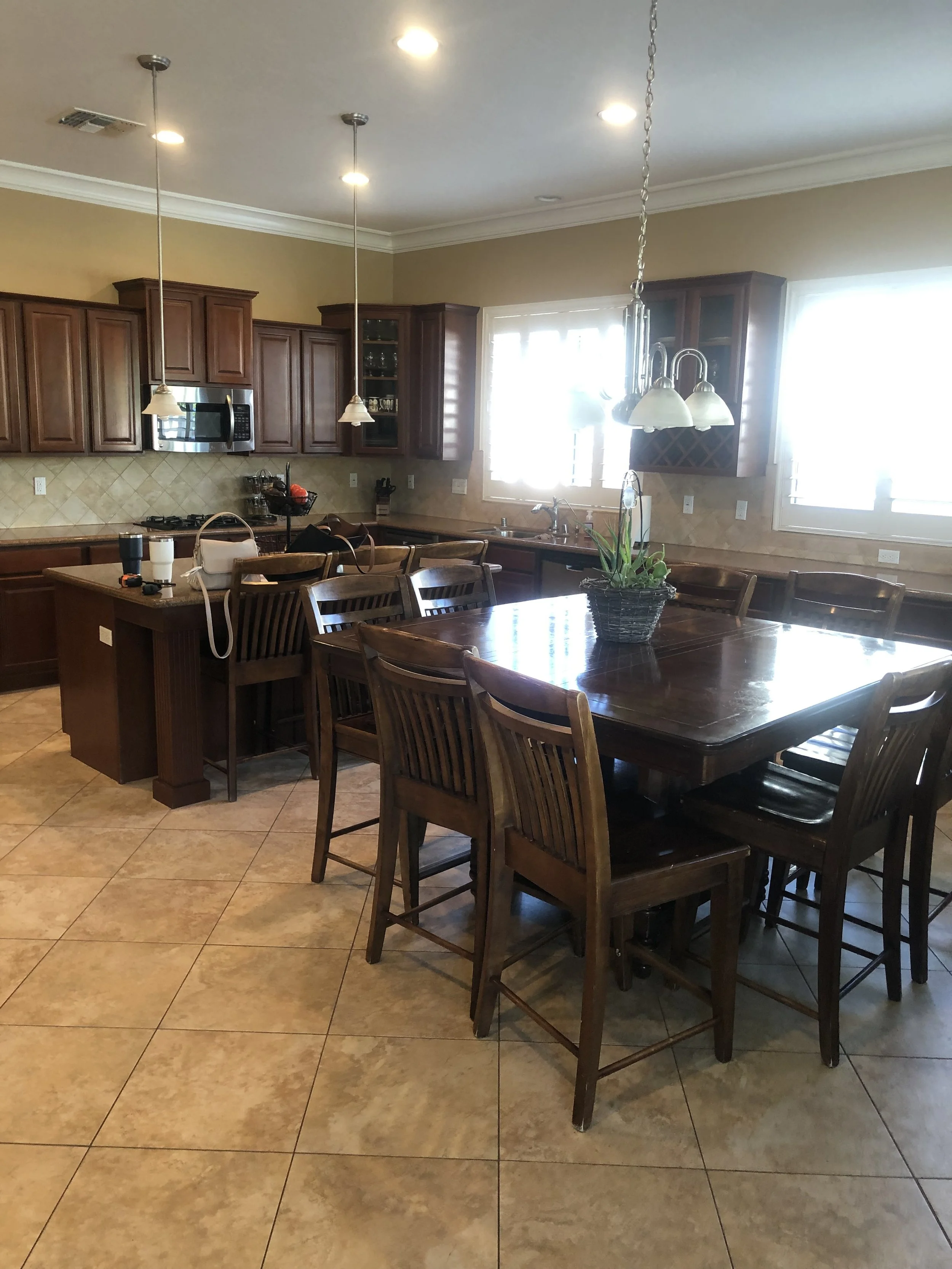
In today's edition, we're taking you inside the heart of the home, giving you a tour of the Canyon Creek Kitchen + Family Room. I think part of what makes this project so incredible is the drastic before and after, considering we didn't change the footprint of the home at all. The existing open floor plan concept transitioned beautifully to something more contemporary, crafted in a way that feels totally timeless. Let's talk through the changes in the kitchen, first:
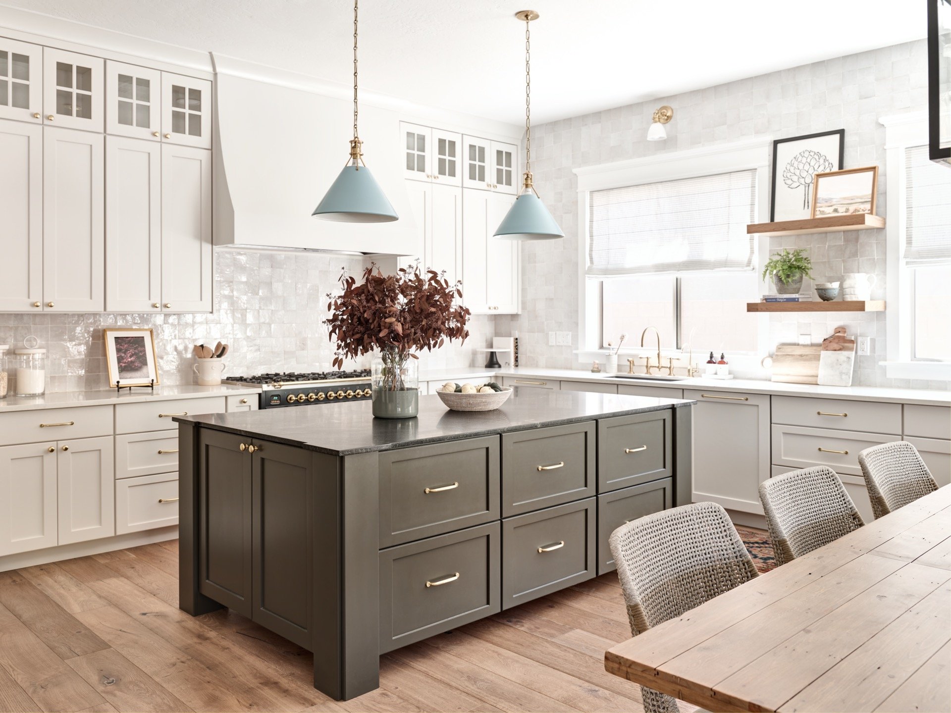
Everything in the kitchen was placed where it should be, but the finishes were dark, heavy and totally outdated. My priority in this space was to brighten it up, open it up, and elevate the space to make every day feel special. We kept the kitchen island just where it was, but increased its size a bit with a custom island in the prettiest dark olive gray. Because the breakfast room sits directly adjacent, there really was no need for an eat-in island. This extra space allowed us to cash in on storage, with the custom built drawers. I love how this piece makes a nod to antique general store counters with its deep pull out bins, but feels totally modern in it's shaker style shape, chunk legs, and peek-a-boo lift. It's all about the details on this piece topped off in black granite (look at the counter detail at the corners!).
We ditched the microwave and extended the range, topping it off with this custom hood. It blends seamlessly into the cabinetry on either side and really lets the beautiful handcrafted tile backsplash shine. We ran the tile all the way around the kitchen, up past the windows, to the clear breakpoint as you enter the family room. The millwork in this kitchen is incredible - I love the window casings that sit on top of the tile and hide the pretty striped linen roman shades.
There is ample storage in this kitchen, and beautiful sprawling countertops. Because of this, we could play with a few floating shelves to bring in color, artwork, and my favorite LW Home pieces. We mixed metals in this space with polished brass and matte black accents, which carried over into the family room too. But of everything in this space, I think my favorite touch is the blue enamel pendant lights over the island! They add the perfect pop of color and keep this space feeling not-too-fussy and totally fresh.
SHOP THE KITCHEN
bread board | marble board | berry bowl | pitcher | artichoke sketch
terrene pot. | faux fern | dish soap | pendants | sconces | sea urchin bowl
BEFORE + AFTER
The Family Room
I am obsessed with the transformation of this family room that sits just off the kitchen. Originally, it has a super odd, asymmetrical fireplace (see before photos below) that made it very difficult for the family to enjoy the space effectively. The layout was a challenge for them, but I knew immediately the solution was to square up the family room, center the fireplace, and add some built-ins. Now you're able to really focus on the giant windows, enjoy the fireplace in cooler months, and hide games for when the family is back in town.
By removing the awkward windows above the old fireplace, we were able to visually "raise the roof" by running the millwork all the way up. On the remaining windows, we ripped out the former shutters that sucked the life out of everything and made it feel like a cave. Then we added custom motorized shades to help filter light in Phoenix's hot sun, while still filling the room with beautiful, glowy natural light.
SHOP THE FAMILY ROOM
Dulcet Sculpture | Metal Twist | Two-Toned Marble Bookends | Black and Brass Frame
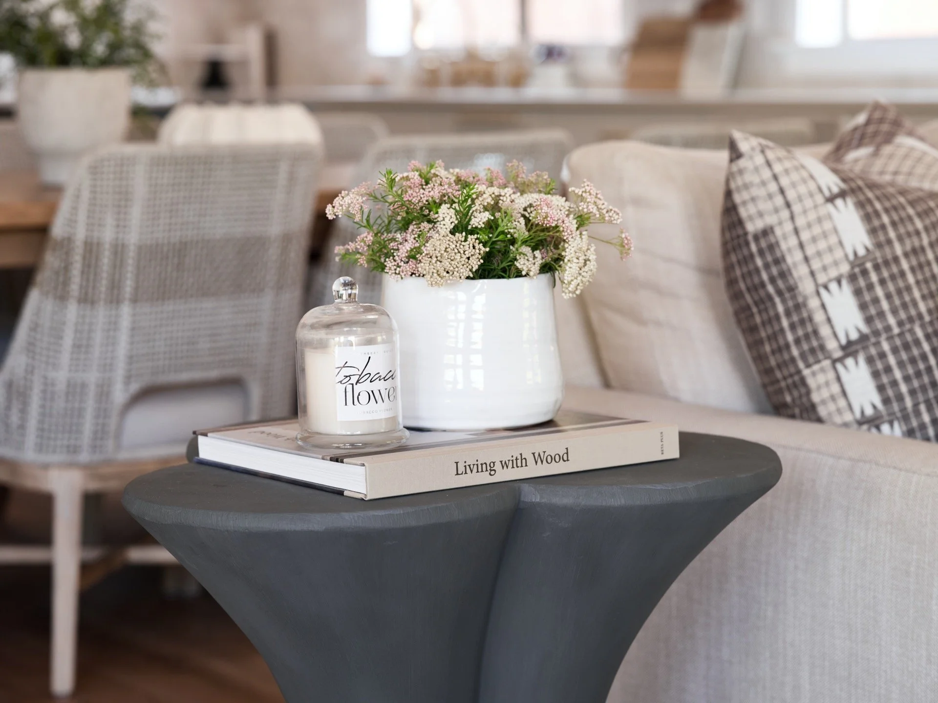
Cambridge Bone Box | Sophia Stoneware Bowl | Sophia Stoneware Pot | Napa Natural Pot
BEFORE + AFTER
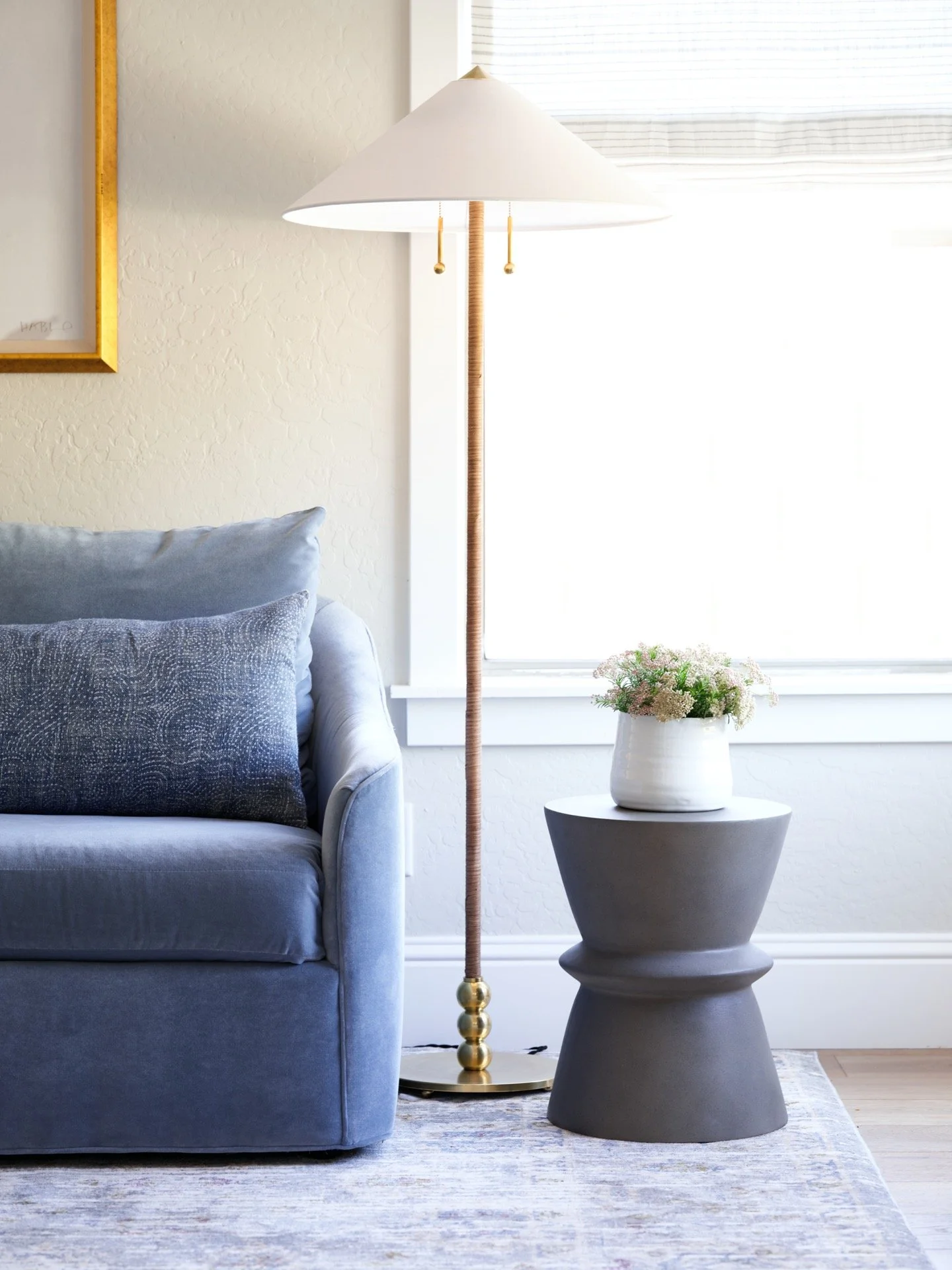
For the furnishings in here, I carefully sourced unique pieces with organic curves and lots of texture. Our clients have great taste, and trusted us entirely, so we were able to play around with unexpected details. I love that it kept the space from feeling too formal or traditional. It's modern, timeless, and totally interesting. Stay tuned as we take you through the rest of the home. We have so much to show you as we head into 2021!
Photography: John Woodcock


