Mountain View Project Reveal: Piano Room
Last week we introduced you to our latest completed project and shared the entry from our Mountain View Project. Today we are back to share this perfectly modern piano room. This space was a little tricky because it is intended to be a formal dining room, so it is long and narrow. By breaking up the room into two different areas, it helps the space feel purposeful while still being functional. On one side of the room we put the piano with a neutral wool rug underneath it to help add warmth and soften up the room. Behind the piano was a very large blank wall so we added an eclectic gallery wall to fill up the space. Not only does the gallery wall look great and add color, but we used pieces of art that have meaning to our clients.
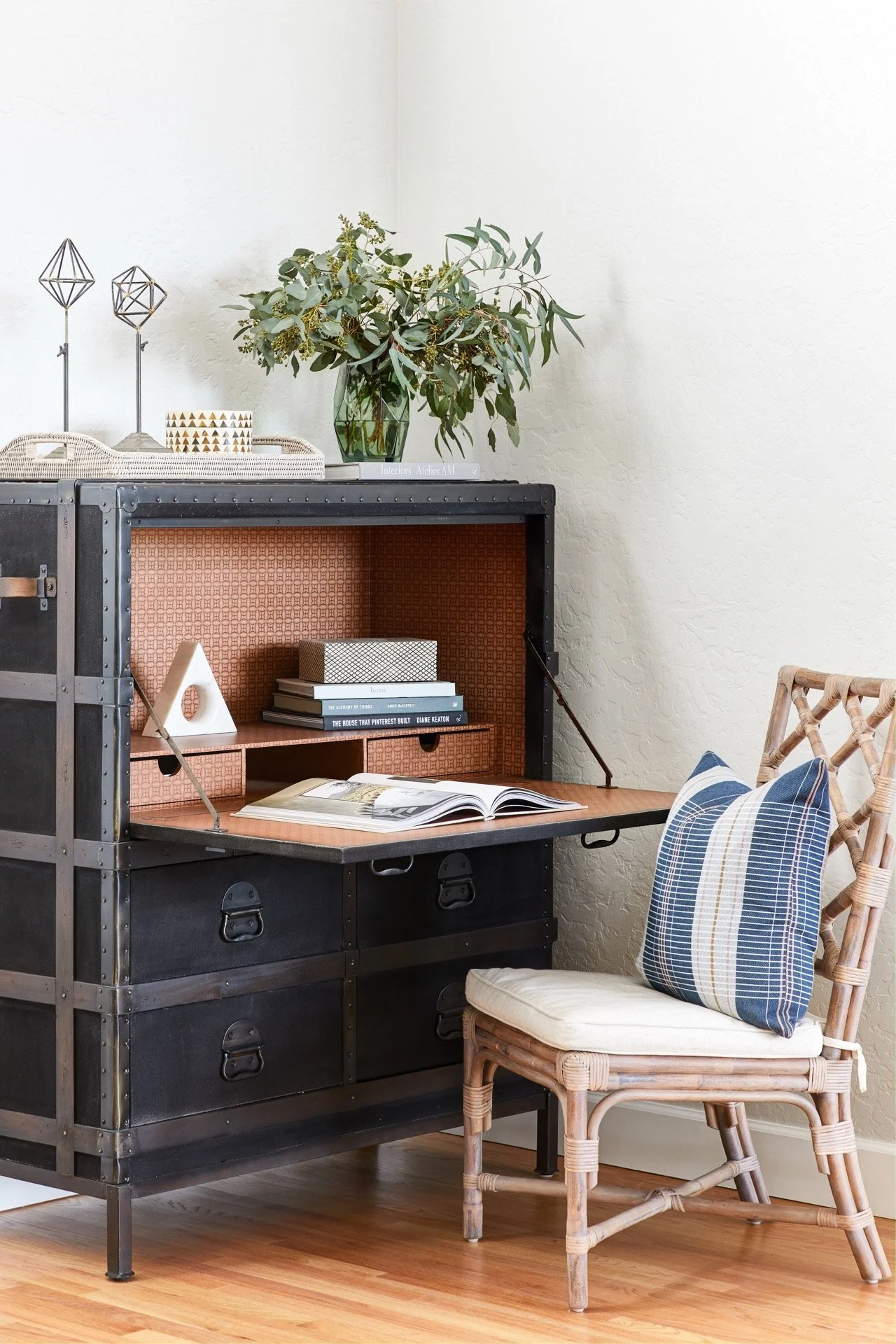
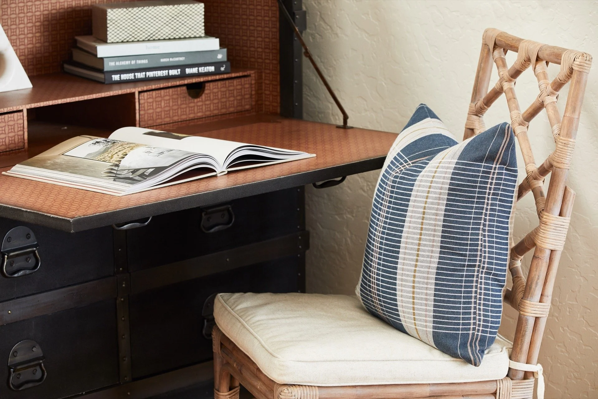
Our clients' kids like to use this space as a place to do their homework and make crafts. So we added this black secretary desk balancing the black baby grand piano on the other side of the room and it's the perfect fit. This piece is so functional and when folded up resembles a vintage trunk adding much needed character to the room. We love the leather handles and the polished black metal details on this piece.
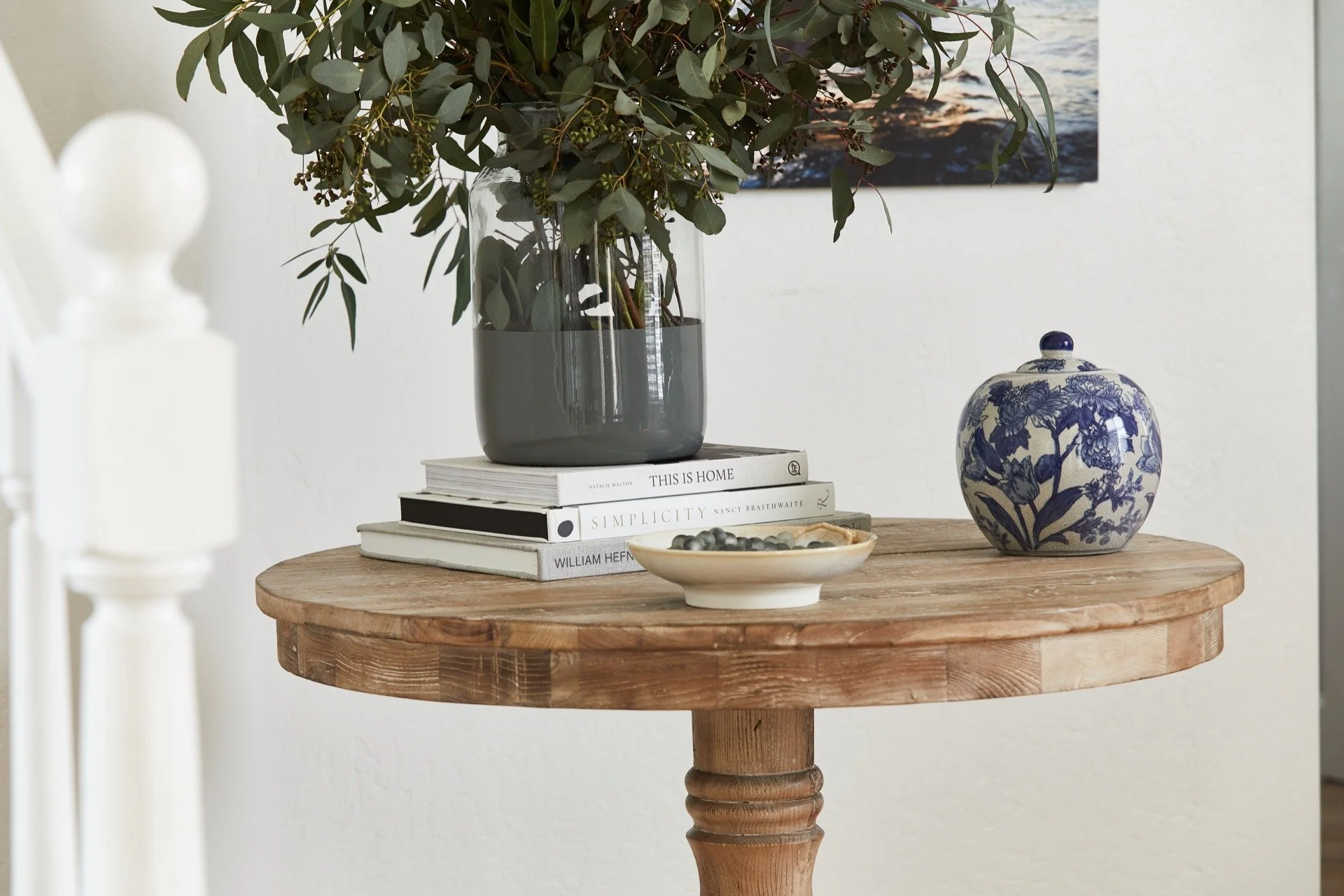
Directly across from the piano room is the staircase leading to the upstairs. The curve of the stairs created an empty space so we added this beautiful natural wood entry table. This color block vase on top of the table is the perfect place to house fresh flowers from the garden. The large scale galvanized pot tucked underneath the table adds depth and texture to the space.
Photography by John Woodcock


