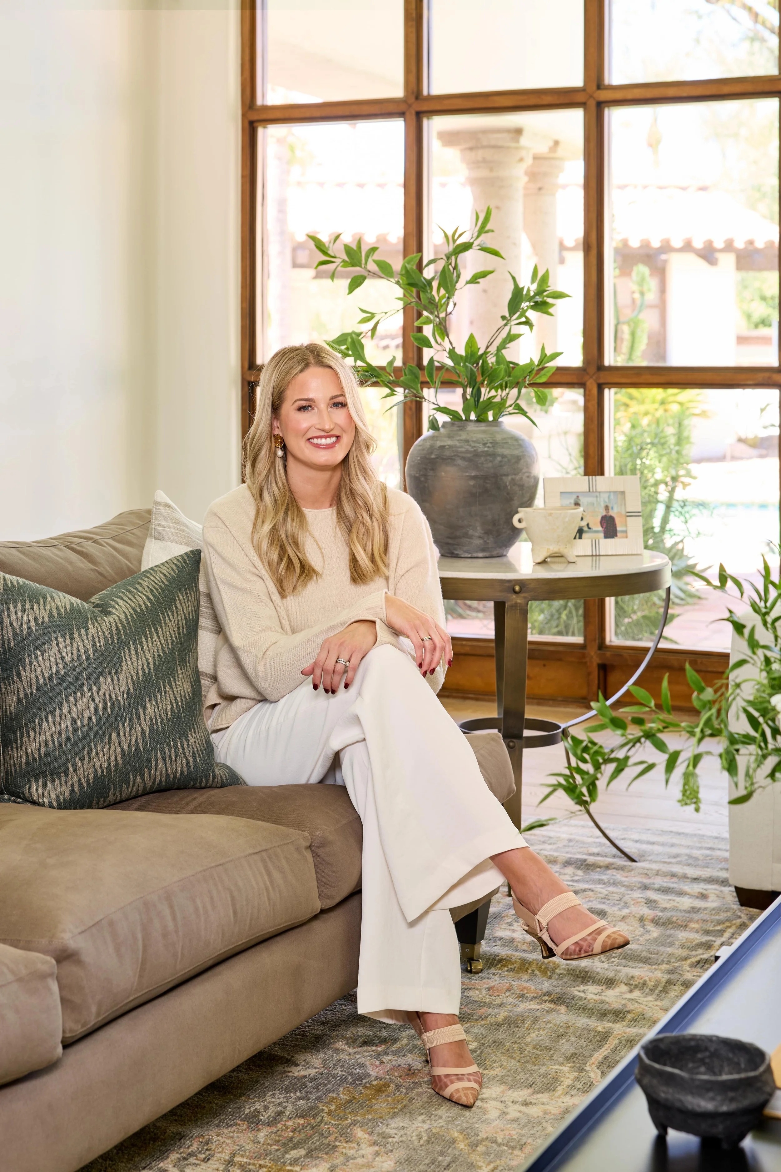
Paradise Valley Project: Entry + Living + Dining
Hey guys! It’s time for another project reveal, and I couldn’t be more excited. Today, we're sharing something truly special—our Paradise Valley Project, a labor of love between us and our amazing clients. The goal of this project was all about creating a space that feels as luxurious and inviting as the stunning property it sits on.
Part of the reason our client’s purchased this home is because they fell in love with the property’s stunning features—a private tennis court, a sparkling pool, and an overall resort-like atmosphere. But while the property was gorgeous, it was clear that the interior needed a thoughtful redesign to match the it’s charm and elegance.
Knowing they would be renovating in the near future, they were focused mostly on new furnishings but the project scope quickly changed. The home was relatively new, but it was suffering from an identity crisis—an odd blend of Spanish architecture with random modern touches that didn’t quite fit. We wanted to bring the space back to its roots. This meant leaning into earth tones and natural materials, emphasizing a slightly rustic, but timeless feel.
Are you as excited as I am? Let’s take a tour!
Entryway
Walking into this home, you're immediately greeted by a grand view of the entry and living room, with your eyes naturally drawn to the stunning wall of windows. To define the space, we selected a beautiful round table and curated accessories to create a striking focal point.
The entryway presented some challenges, starting with the a unqiue floor tile that we lovingly named the “hot dog” flooring. While functional, it didn’t set the right tone. We replaced it with gorgeous hardwood floors throughout, adding warmth and character that immediately transformed the space.
The original ceiling mosaic didn’t align with the desired aesthetic, so we removed it and replaced the outdated light fixture for a more cohesive look. We also modernized the staircase (not pictured) by adding integrated lighting for both safety and style, making it easier to navigate after dark. This thoughtful update was a great addition that the client’s very much appreciated.
BEFORE + AFTER
Living Room
The living room needed a little extra love to make it truly shine. The expansive window naturally became the focal point, with the stunning limestone fireplace serving as a close second, styled with art and vases for a curated touch.
We added plush sofas, fun chairs, and earthy tones carried through the furniture and accessories to tie the space together. The large coffee table became the star, styled with layered textures—coffee table books, vases, bowls, and more—to create a dynamic, curated look.
To balance the fireplace, we designed a custom console table paired with oversized art to fill the large, empty wall. While this room may not be used daily by our clients, it makes a lasting first impression—and I couldn’t love it more!
BEFORE + AFTER
The Dining Room
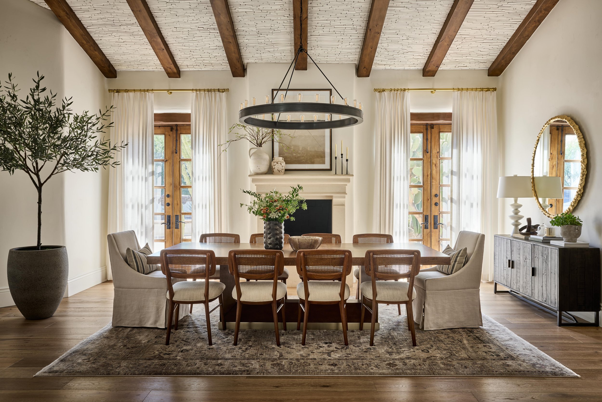
This dining room is truly a showstopper! From the gorgeous ceiling beams to the warm wood French doors and the cozy fireplace—wow. We chose a 10-person dining table that perfectly complements the wood tones in the room, paired with linen end chairs and fun wicker and cream side chairs for a mix of textures. To balance the warmth, we added vintage-style rug for contrast and visual interest.
Painting the ceiling was crucial to this transformation. We loved the existing tile for its visual interest, but we gave it a fresh, bright look with a new coat of paint. We selected a console table with a beautiful textured gold mirror above, bouncing light throughout the space.
I love how this room came together! Take a peek at aallll the details.
BEFORE + AFTER
The Final Look
The result is a stunning home that blends rustic charm with modern sensibilities. Every room feels thoughtful, functional, and beautifully curated, showcasing the best of the home’s architecture while providing a comfortable space for the family to relax and entertain. The combination of earth tones, natural materials, and personal touches throughout the home makes this property feel both timeless and uniquely theirs. We’re thrilled with how it turned out and are so excited for the clients to enjoy their new space for years to come.
Stay tuned for next week when we reveal the family room and boy’s bedroom.
Xoxo,
Lexi
Photographer: John Woodcock


