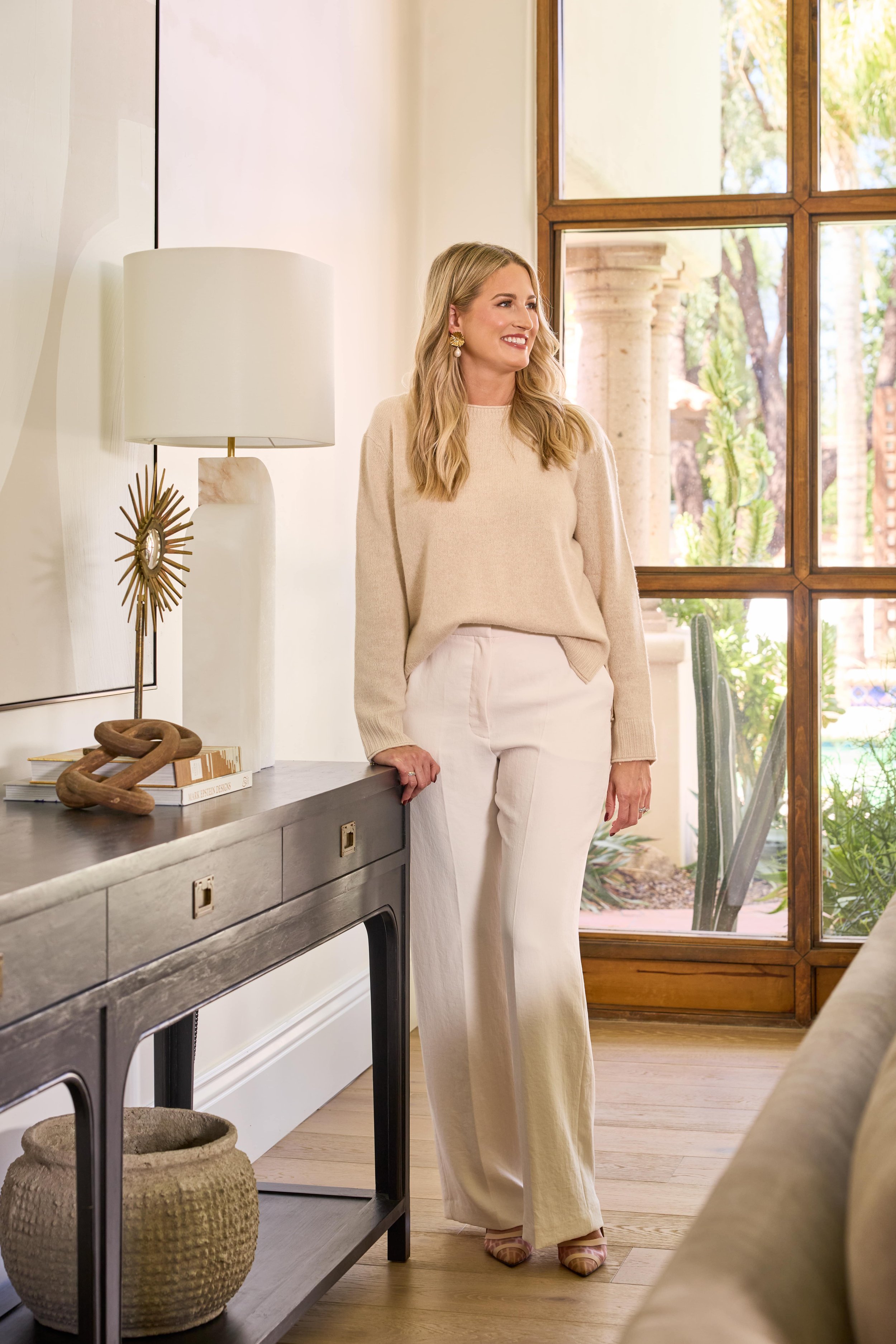
The New + Improved LWD Website
This year has been all about evolution behind the scenes at LWD. We’ve redefined our processes, elevated our approach, and most excitingly, transformed our online presence. Bringing in a new marketing director was the catalyst; with her vision, we decided it was time for a fresh, dynamic look to reflect our luxurious, layered design philosophy.
What started as a simple refresh blossomed into a complete redesign, transforming every element with precision and purpose. The result is a site that embodies the spirit of LWD—thoughtfully crafted and fully immersive, designed to engage and resonate at every level.
We’re thrilled to welcome you to our new digital space and can’t wait for you to explore it. Let the tour begin!
HOME
Our previous website leaned heavily into negative space, which gave it an airy, minimalist elegance that served us well for years. But as our style has evolved, so has our vision for the digital experience we wanted to create. We knew it was time for something that felt richer, more inviting, and aligned with our luxurious, layered aesthetic.
One of my favorite new features is the full-bleed photo on the homepage. It’s designed to pull you right in, creating a sense of immersion that mirrors the feeling of stepping into one of our curated spaces. This layout shift reflects our commitment to crafting environments that are both visually captivating and deeply resonant.
ABOUT
This page might just be my favorite—it’s where we’ve truly encapsulated who we are, what we do, and how we do it. Here, you’ll find our studio philosophy, a look at our services, a bit about my journey, and an incredibly detailed FAQ section. We wanted this page to be a warm welcome and a comprehensive guide for anyone curious about working with us.
The FAQ section, in particular, was a labor of love. We poured over every detail to ensure each answer not only informs but also reflects our values and the care we bring to each project. If you’re considering a collaboration or simply want a deeper understanding of our process, this page is a great place to start.
PORTFOLIO
I couldn’t be more thrilled with my new portfolio—it’s truly a reflection of the artistry and depth we strive to bring to each project. It’s immersive, visually stunning, and showcases our work in a way that makes me incredibly proud. I’d love for you to take a look and experience the transformation yourself—see our new portfolio layout and design versus our previous one. While I always loved my portfolio, this new version feels like a true celebration of our growth and vision.
READ
Building a sense of community is key to what we do, so we’ve given our blog a thoughtful makeover. Rather than simply calling it “Blog,” we decided to change it to “Read.” The transformation is truly stunning, with a refreshed layout that makes exploring our content a more immersive experience. I couldn’t be more thrilled with how it turned out!
INQUIRE
Our Inquire page has undergone a beautiful transformation, and I couldn’t be happier with the result. It’s the perfect balance of elegance and practicality, with all the contact information you need and an easy-to-use inquiry form. This page is designed to make the first step in starting a project with us seamless and inspiring. While we’re currently fully booked for the rest of the year, we’re now accepting inquiries for 2025 projects!!
If you’ve made it all the way here, thank you for taking the time to explore our new website and for supporting the LWD journey. We’re incredibly grateful for this community and excited to create even more beautiful spaces in 2025. Here’s to new beginnings and continued inspiration!
Xoxo,
Lexi
Photographer: John Woodock


