Hermosa Groves Paint Guide
Whenever we share a new project, the most common question we get is “what is the paint color is that?” So here it is, all the paint colors used in our latest project, Hermosa Groves. Get your notebook out! It’s time to write down all of the gorgeous colors in this remodel.

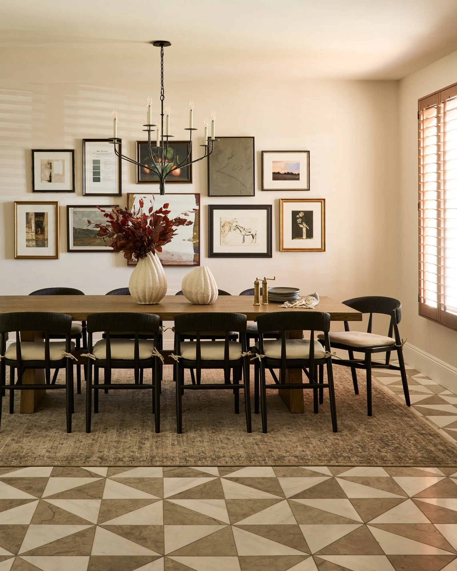
Walls + Trim
We went classic with Swiss Coffee on the walls and Chantilly Lace on the trim. Two colors I adore.
For a timeless, high-contrast look, try Benjamin Moore’s Swiss Coffee (Eggshell) on the walls and Chantilly Lace (Satin) on the trim. Swiss Coffee’s warm, creamy white keeps the space feeling soft and inviting, while Chantilly Lace’s crisp, clean white makes architectural details pop. The eggshell finish on the walls gives a subtle, light-catching glow, and the satin trim adds a touch of sheen for depth.
Together, they strike the perfect balance between cozy and fresh—a combo that works in any style or lighting.
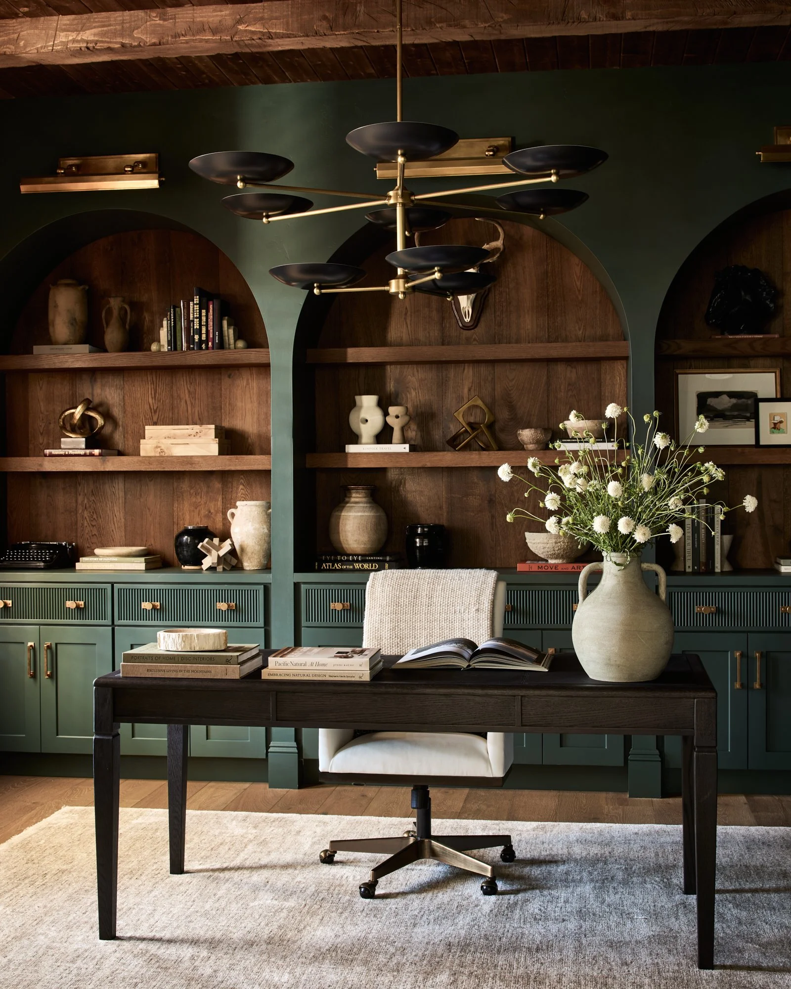
The Office
In the office, we went all-in with Benjamin Moore’s Calico Blue. We chose an eggshell finish on walls and a satin finish on the trim.
We paired it with medium oak-stained beams and shelves. Although its name references blue, in person it reads as a sophisticated green that shifts with the light. The warm oak adds natural texture and rich contrast, keeping the palette dynamic and inviting. Using the same color across the walls, trim, and built-ins creates a seamless, custom look.

Living Room
In the living room, we have Swiss Coffee and Chantilly Lace on the walls, which set the stage for rich, grounding accents.
The built-ins are painted Van Buren Brown by Benjamin Moore—a deep, rich brown tone that adds warmth and depth. The fireplace is finished in Wind’s Breath, also by Benjamin Moore, with a plaster texture for a soft, organic feel. Behind it all, a patterned grasscloth wallpaper brings in another layer of texture and visual interest (we’re keeping the exact source private for our client).
The mix of crisp trim, creamy walls, moody built-ins, and tactile finishes makes the room feel layered, intentional, and effortlessly elevated.
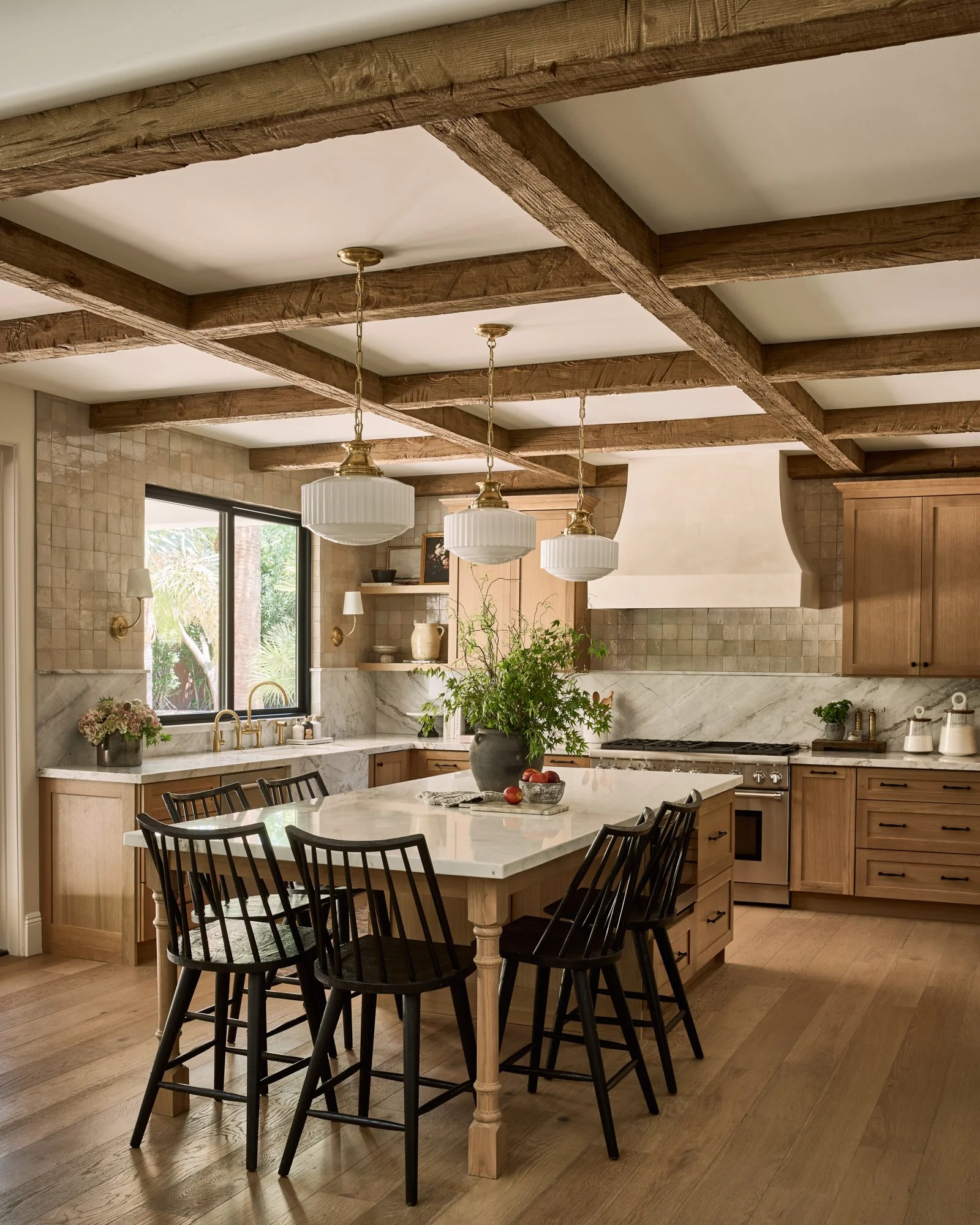
The Kitchen
The kitchen hood is finished in Wind’s Breath by Benjamin Moore, using a plaster texture that brings in a soft, organic feel—perfect for grounding the space with subtle depth and artisan character. This plaster finish complements the surrounding cabinetry and finishes, giving the kitchen a tactile, elevated look without overwhelming the design. And of course, it calls to across the room to the fireplace in the living room. A perfect way to tie to these two spaces together.
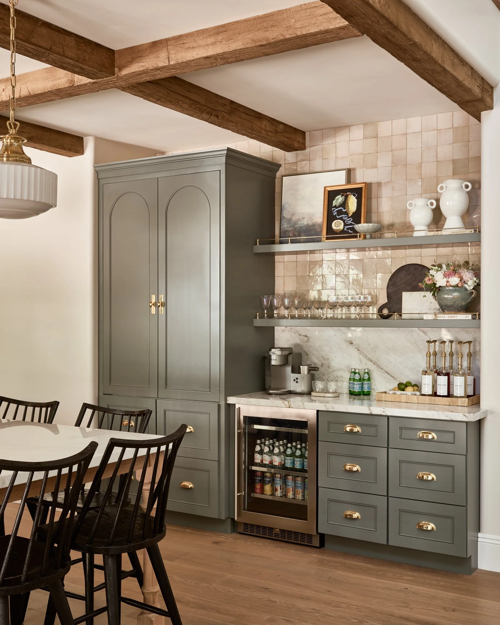
The Drink Station
Tucked within the kitchen, the beverage station stands out with Sherwin-Williams Homburg Gray—a moody, sophisticated gray that adds modern contrast and a touch of drama. It creates a chic focal point without stealing attention from the warm plaster textures nearby, balancing the space with sleek coolness and visual interest.
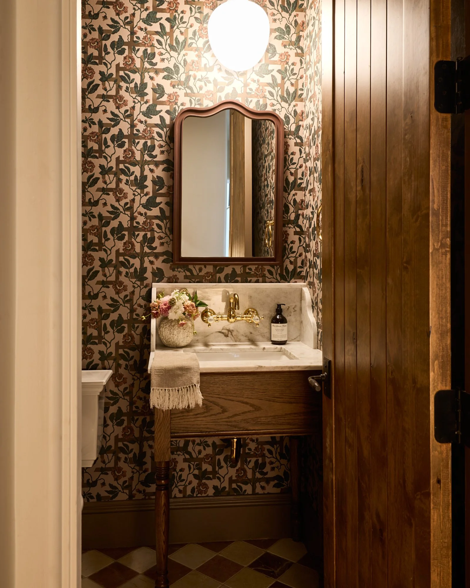
Powder Bath
When choosing paint colors for a wallpapered room, we always start by pulling a shade directly from the wallpaper itself. For the powder bath, that meant selecting Farrow & Ball’s London Clay—a deep, earthy tone that feels warm and inviting. We used it flat on the ceiling to create a soft, matte backdrop, then switched to satin on the crown molding, baseboards, casing, and interior door edges for just the right amount of sheen to highlight those architectural details. This created a cozy, intimate space that feels carefully curated and effortlessly polished.
That’s all, friends! We hope this paint guide has inspired you and provided some fresh ideas for your own spaces. Happy painting!
Xo,
Lexi


Contractor: Royal Finishes Construction
Photographer: John Woodcock