The Luxury Designer’s Guide: Shelf-Styling
Hey everyone! I'm back with another edition of The Luxury Designer's Guide, and today we’re tackling a topic many of you requested: shelf styling.
Styling shelves is an art that requires the right mix of asymmetry, groupings, textures, and shapes. It’s normal to feel overwhelmed by this task, but don’t worry—I’m here to help! I’ll be sharing my proven tips for styling shelves in luxury design projects. In almost every home I've designed, I’ve encountered large bookcases or shelving units that serve as a canvas for creativity. Over the years, I've developed a formula that consistently produces great results. So, let’s jump into the world of shelf styling!
Before we dive in, let’s clarify some terminology. First, we have groupings, which refer to the intentional arrangement of items. Then, clusters are similar items placed closely together. Finally, a vignette is a curated collection of objects that highlights your favorite pieces. When styling shelves, we’re creating groupings, clusters, and vignettes. Understanding these terms will help avoid any confusion!
Now, let’s focus on our goal: creating visual interest. We achieve this by intentionally arranging objects to complement one another, using a mix of heights, textures, materials, and shapes.
Types of styling objects
Vases
Art
Plants / greenery
Picture frames
Books
Boxes
Bowls
Bookends
Decorative Objects
Coffee table books (you can never have too many of these!)
Tip 1: Prep with way more styling objects than you anticipate actually needing.
Prepare with more styling objects than you think you'll need. This way, the process can flow smoothly and quickly. Having extra options on hand provides flexibility and creativity during styling. You won't need to pause and search for additional items, saving time and effort. With a variety of objects ready, you can experiment freely to find the perfect arrangement for your shelves. So, gather plenty of styling elements upfront—it'll make the process much easier.
Tip 2: Group items in pairs or threes. These objects should vary in height, texture, and shape to create visual interest.
When it comes to styling shelves, grouping items in pairs or threes is a tried-and-true technique that adds depth and visual appeal to your display. Groupings of two objects create a sense of balance and symmetry, ideal for showcasing complementary pieces such as vases and picture frames. By varying the height, texture, and shape of each item within the pair, you create a dynamic composition that captures the eye.
On the other hand, groupings of three objects allow for more versatility and complexity in your arrangement. This arrangement lends itself well to incorporating a mix of objects, from books to decorative boxes, while still maintaining a sense of cohesion and harmony. Whether you opt for pairs or threes, the key is to play with different combinations until you find the perfect balance that enhances your shelf's aesthetic.
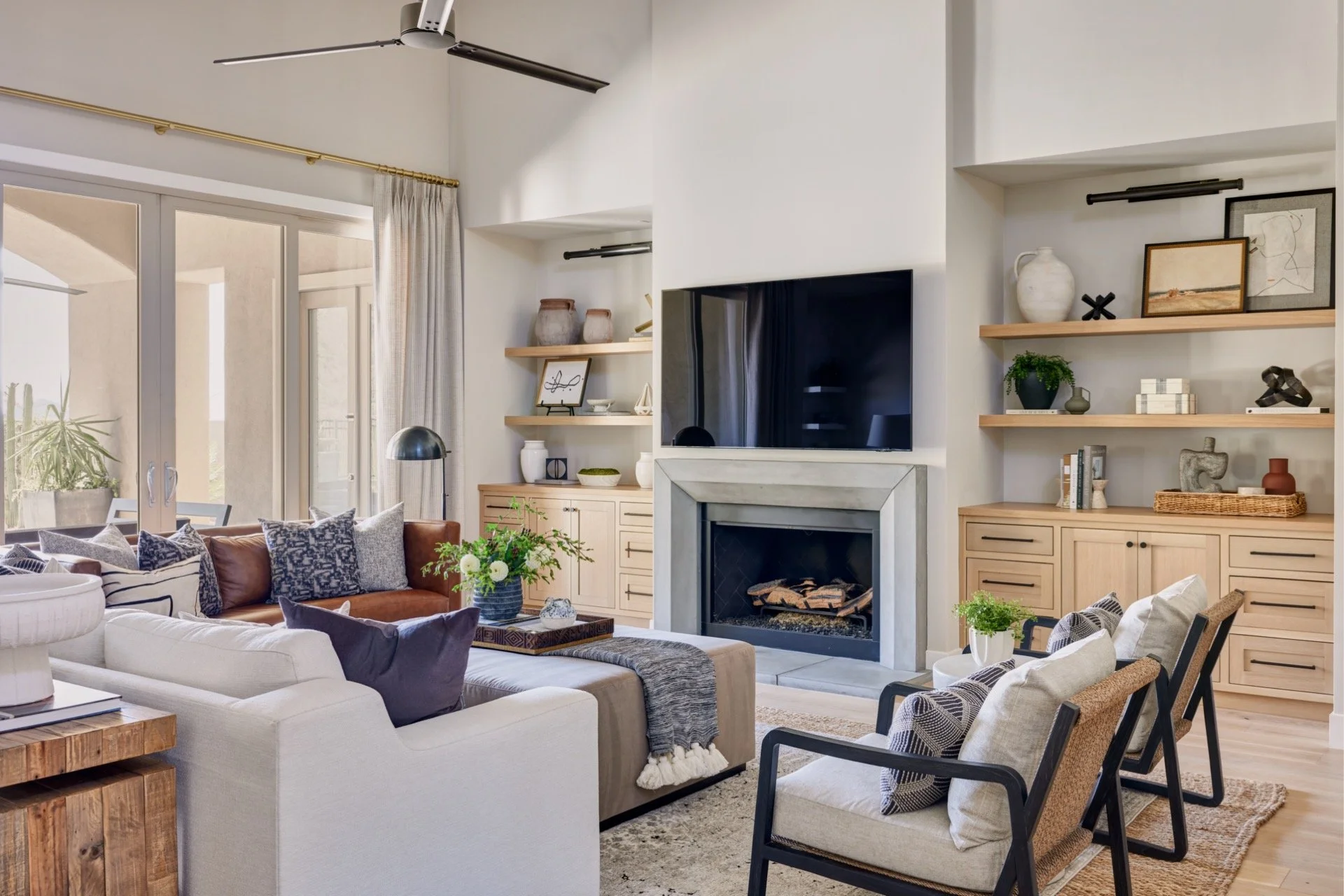
See the photo below which shows pairings of two and three. Items are either stacked or paired next to each other.
Tip 3: Focus on one shelf at a time. It's not a race.
Take your time when styling each shelf, focusing on one at a time. It's not about rushing through the process but about giving each shelf the attention it needs. By concentrating on one shelf, you can carefully consider the placement of each item and how they work together. Remember, shelf styling is a deliberate process, so don't feel pressured to finish quickly. Take the opportunity to experiment and adjust until you're satisfied with the result. So, slow down, tackle one shelf at a time, and enjoy the process of creating a visually appealing display.
Tip 4: Alternate styling per shelf. You don't want the styling to be the same on each shelf, this takes away visual interest.
Mixing up your styling approach from shelf to shelf is key to maintaining visual interest throughout your display. Avoiding repetition ensures that each shelf stands out on its own, contributing to the overall appeal of your design. By alternating your styling techniques, like varying groupings or adjusting object placement, you create a more dynamic and engaging composition. This keeps the eye moving and prevents boredom. Experiment with different arrangements, textures, and colors on each shelf to add depth and personality to your display. The goal is to create a cohesive yet captivating look that draws viewers in and keeps them exploring.
See photo for example.
Tip 5: Don't be afraid to move individual objects or whole groupings around. You can always move a well-styled vignette to a different shelf if it works better. I give you permission.
Feel free to move things around as needed, whether it's individual objects or entire groupings. Don't hesitate to adjust until you're satisfied. If a well-styled vignette looks better on another shelf, go ahead and move it. You have the freedom to tweak your display until it looks perfect. This flexibility allows you to refine your design until it's just right, so don't be afraid to experiment. Trust your instincts and enjoy the process of creating a visually appealing design that resonates with you.
Bonus Tip: Don't feel defeated if it takes a while. That's normal! (It takes the experts awhile too)
It's completely normal for styling shelves to take some time, so don't feel disheartened if it doesn't happen quickly. Even experts in the field can spend a while perfecting their displays. Achieving the right balance and visual appeal often requires patience and experimentation. So, take your time and trust the process. Remember, the journey of creating a beautifully styled shelf is as important as the end result.
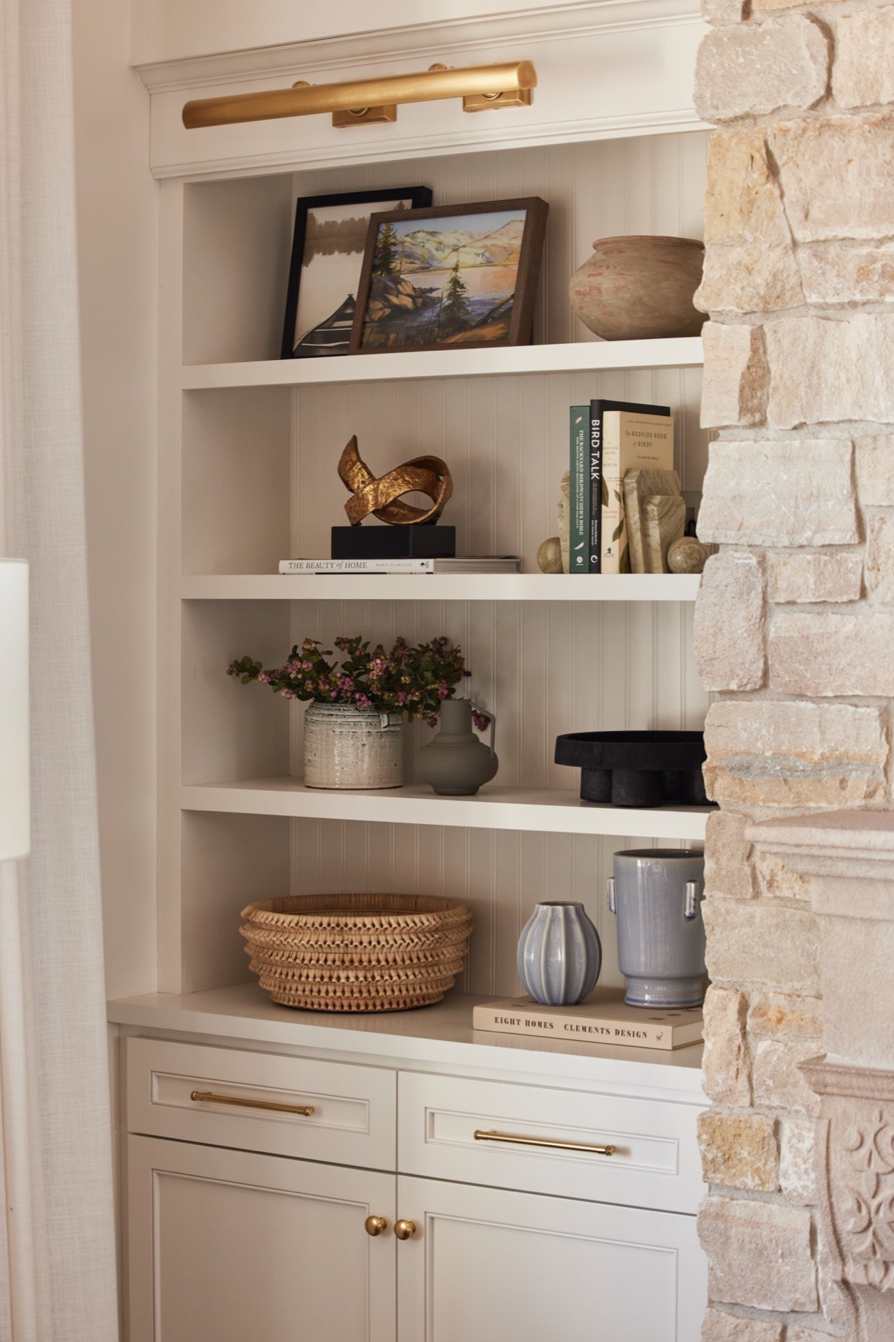
Now, let's delve into the image above and examine why the styling of each shelf works seamlessly. This will allow you apply what you've learned.
Starting from the top shelf, we notice two pots on the left, identical in design but different in height. This creates a sense of uniformity while allowing them to complement each other. Placing the taller pot at the end anchors them in place effectively. On the opposite side, two books are stacked with an abstract metal object on top, offering visual interest through varying textures and shapes. The books serve as a pedestal, elevating the object.
Moving to the middle shelf, we find a piece of art on an easel, providing a unique way to highlight its significance. The tall frame stands over a small white ceramic bowl atop a coffee table book, adding diversity with its round shape amidst rectangular objects. On the right side, a cool white abstract object sits alongside two stacked books and a potted plant, creating a balanced grouping with varying heights and textures.
Finally, on the bottom shelf, two tall white jars of different shapes anchor the objects in the middle. The jar on the right is accompanied by a smaller, similarly shaped jar, fitting snugly into its spot. On the left, a book and object are paired next to a medium size jar similar to the ones found on the right, while in the center rests a wooden bowl with a green plant, completing the cohesive styling of the shelf.
To wrap up, mastering shelf styling requires creativity, patience, and attention to detail. By incorporating various objects and following key principles like grouping and alternating styling, you can transform your shelves into captivating focal points. Remember, it's not about perfection but about creating visual interest and reflecting your style. So gather your objects, take a breath, and enjoy the process. With these tips, you're ready to style your shelves confidently and bring elegance to your home.
Photography: John Woodcock


